
Google Charts is a popular library for creating interactive and dynamic data visualizations on the web with JavaScript. In this tutorial, we’ll explore the basics of Google Charts and how to use it to create different types of charts.
What Are Google Charts?
Google Charts is a JavaScript library that provides a simple way to create a variety of charts and graphs using HTML, CSS and JavaScript. It’s free to use and can be easily integrated into any web application or website.
Google Charts offers a wide range of chart types, including bar charts, line charts, pie charts, scatter charts and more. It also provides many customization options, allowing you to choose colors, fonts, labels and other chart properties to fit your needs.
Getting Started with Google Charts
To get started with Google Charts, the first thing you need to do is include the library in your HTML file. You can do this by adding the following code to the head section of your HTML file:
<script type="text/javascript" src="https://www.gstatic.com/charts/loader.js"></script>Next, you need to insert a div element to your HTML document to display a chart.
<!--Div that will hold the chart-->
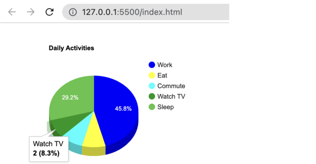
<div id="chart"></div>Let’s move on to the JavaScript part now. In this step, we will load the Google Charts API and use it to create a pie chart with customizable options. To create a chart, we first need data to display. We can achieve this by passing our data array to the arrayToDataTable function, which will convert an array into a table format.
// Load the Visualization API and the corechart package.
google.charts.load("current", { packages: ["corechart"] });
// Set a callback to run when the Google Visualization API is loaded.
google.charts.setOnLoadCallback(drawChart);

function drawChart() {
  var data = google.visualization.arrayToDataTable([
    ["Task", "Hours per Day"],
    ["Work", 11],
    ["Eat", 2],
    ["Commute", 2],
    ["Watch TV", 2],
    ["Sleep", 7],
  ]);

  var options = {
    title: "My Daily Activities",
  };

  var chart = new google.visualization.PieChart(
    document.getElementById("chart")
  );

  chart.draw(data, options);
}
Here is the result:

Customize Chart | Options
To customize a chart in Google Charts, you can use the options object that is passed as an argument to the draw method of the chart object. This options object allows you to customize various aspects of the chart’s appearance and behavior.
Here are some common options you can use to customize a pie chart in Google Charts:
- title: Sets the title of the chart.
- width: Sets the width of the chart in pixels.
- height: Sets the height of the chart in pixels.
- legend: Controls the display of the chart legend.
- colors: Sets the colors used for each slice of the pie chart.
- pieHole: Specifies the size of the hole in the center of the pie chart.
- pieSliceTextStyle: Specifies the font size, color, and style of the slice labels.
- is3d: Specifies whether chart is 3D or not
And here is the our options to customize the pie chart and its apperance with this options:
var options = {
  title: "Daily Activities",
  is3D: true,
  width: 400,
  height: 300,
  colors: ["blue", "yellow", "aqua", "#109618", "#56c345"],
  pieHole: 0.4,
  tooltip: { textStyle: { fontName: "Arial", fontSize: 12 } },
  pieSliceTextStyle: {
    color: "white",
    fontSize: 10,
    fontName: "Arial",
  },
};
Different Types Of Google Chart
Google Charts provides a variety of chart types that you can use to display your data in different ways. Here are some of the most common chart types:
- Line Chart: Shows trends in data over time, using a series of connected data points.
- Bar Chart: Displays data as rectangular bars, with the length or height of each bar proportional to the value being represented.
- Column Chart: Similar to a bar chart, but with vertical bars instead of horizontal bars.
- Area Chart: Displays the trend of data over time, but fills in the area under the line.
- Scatter Chart: Shows the relationship between two variables, with data points plotted on a two-dimensional grid.
- Pie Chart: Displays the proportion of each data category as a slice of a circular pie.
- Donut Chart: Similar to a pie chart, but with a hole in the center.
- Bubble Chart: Similar to a scatter chart, but with data points represented as bubbles with varying size and color.
- Gauge Chart: Displays a single value within a range of possible values, with a needle pointing to the current value.
- Combo Chart: Allows you to combine two or more chart types in a single chart.
These are just a few examples of the chart types available in Google Charts. Each chart type has its own set of options and customization features that allow you to create a chart that meets your specific needs.
So, you can find more detail in google chart documentation page
Data Integration
Google Charts is compatible with various data sources, including JSON data, Google Sheets, and SQL databases. You can dynamically update your charts as your data changes, ensuring that your visualizations stay up-to-date.
Below is an example of integrating Google Charts with data from a Google Sheets spreadsheet. This example will show you how to retrieve data from Google Sheets and create a chart using Google Charts.
1. Set Up Your Google Sheets Spreadsheet
Start by creating a Google Sheets spreadsheet with some sample data. For this example, let’s create a simple spreadsheet with two columns: “Month” and “Sales.” Populate the cells with data like this:
| Month | Sales |
|-----------|-----------|
| January | 100 |
| February | 150 |
| ... | ... |
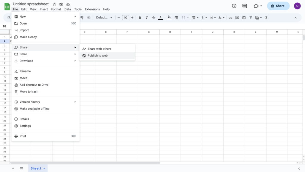
| December | 200 |2. Publish Your Google Sheets Data
To access your Google Sheets data programmatically, you’ll need to publish it. Follow these steps:
- Open your Google Sheets spreadsheet.
- Go to
File>Share/Publish to web. - In the “Link” tab, select the sheet you want to publish.
- Choose the format as “Web page” and click the “Publish” button.
- You’ll be provided with a link. Copy this link as you’ll use it to fetch data in your code.
3. Create an HTML File
Create an HTML file (e.g., index.html) that will host your chart. Include the Google Charts library and write JavaScript code to fetch data from your published Google Sheets document and create a chart.
<!DOCTYPE html>
<html lang="en">
<head>
    <meta charset="UTF-8">
    <title>Google Charts Data Integration Example</title>
    <script type="text/javascript" src="https://www.gstatic.com/charts/loader.js"></script>
    <script type="text/javascript">
        google.charts.load('current', {'packages':['corechart']});
        google.charts.setOnLoadCallback(drawChart);

        function drawChart() {
            // Fetch data from Google Sheets
            var query = new google.visualization.Query('YOUR_PUBLISHED_SHEET_LINK_HERE');
            query.send(handleQueryResponse);
        }

        function handleQueryResponse(response) {
            if (response.isError()) {
                console.error('Error in query: ' + response.getMessage() + ' ' + response.getDetailedMessage());
                return;
            }

            var data = response.getDataTable();

            var options = {
                title: 'Monthly Sales',
                legend: { position: 'none' }
            };

            var chart = new google.visualization.ColumnChart(document.getElementById('chart_div'));
            chart.draw(data, options);
        }
    </script>
</head>
<body>
    <div id="chart_div" style="width: 800px; height: 400px;"></div>
</body>
</html>
Make sure to replace 'YOUR_PUBLISHED_SHEET_LINK_HERE' with the actual link you obtained from step 5 in the previous section.
Now, when you open the index.html file in your web browser, it will fetch data from your Google Sheets spreadsheet and display it as a column chart using Google Charts.
This example demonstrates how to integrate Google Charts with Google Sheets data. You can similarly integrate Google Charts with other data sources like JSON or SQL databases by fetching the data in your JavaScript code and then creating the chart.
Conclusion
In this Google Charts tutorial, you’ve learned the basics of getting started with Google Charts, from including the library in your project and creating your first chart to integration your google sheets with google charts. With just a single line of code, you can create advanced charts to display on your website.
Thank you for reading.